

Guide · Paint colors
How should you choose paint colors for your home?
Compare colors side by side to read their undertones, check how much light they reflect, and test a large sample on every wall, morning to night, before you commit. Outside, start from what you are not repainting: the roof, stone, brick and plantings. Here is how, from the paint makers’ own guidance.
- Bonded & insured
- Free, no-pressure estimates
- Written warranty up to 10 years
Short answer
The short answer
Every paint color has an undertone, the hue beneath the color you notice first, and Sherwin-Williams calls it the harder part to spot. Benjamin Moore’s answer is to judge colors side by side rather than one at a time, because even whites and grays lean warm or cool. Then the light decides how a color reads: which way the room faces, the hours you use it and its bulbs. Sherwin-Williams suggests choosing for the time of day you use a room most, and choosing the bulbs first in a room lit mostly by lamps; Benjamin Moore notes that bulbs above about 3500K cast cooler.
So narrow the choice on chips, by undertone and by how much light a color reflects (its LRV), then test large samples where the paint will go: a Benjamin Moore sample jar covers about 2 ft square in two coats, and the company suggests looking at it from morning to evening, in daylight and under the room’s own lights. Choose the sheen for the wear: in Benjamin Moore’s words, finishes run from more forgiving of imperfections to more durable. Outside, its advice is to start from what you are not repainting: the roofing, stone, brick and landscaping.
Written by Modern Painters LLC. Last reviewed 23 October 2026. Sources are listed at the end.
Six steps
- Note which way the room faces, and when you use it
- Compare chips side by side, and against plain white
- Check the LRV printed on the chip
- Paint a sample about 2 ft square, in two coats
- Look at it on every wall, morning to night
- Pick the sheen for the room’s wear
Undertones
Undertones: why one gray reads warm and another blue
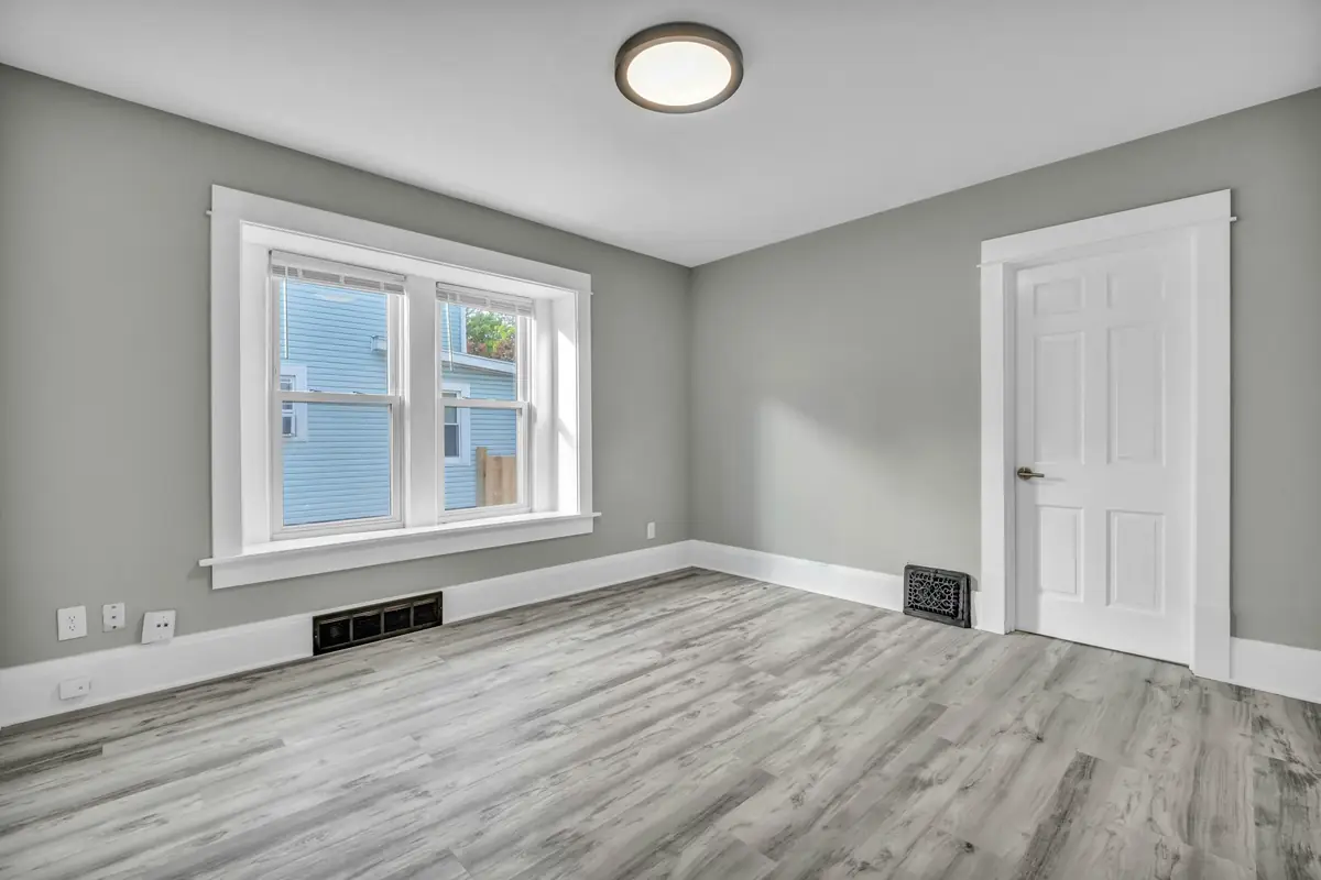
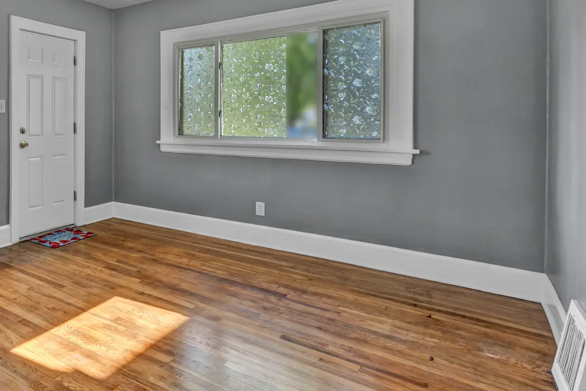
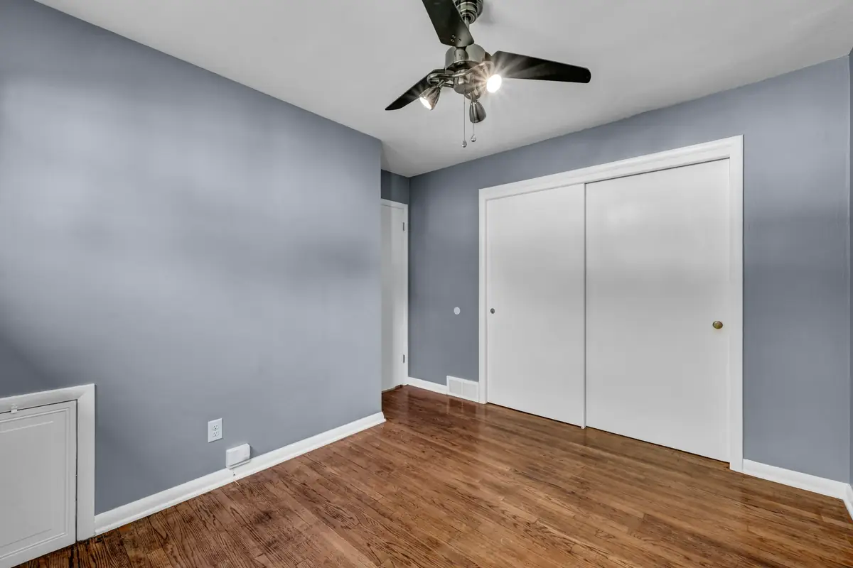
Sherwin-Williams describes every paint color in two layers: the mass tone, the color you notice first, and the undertone, the hue underneath it, which is harder to see. Warm colors usually carry orange, yellow or red undertones, and cool colors blue, green or purple. Neutrals are no exception: Benjamin Moore points out that whites and grays lean warmer or cooler depending on their undertones.
Greige, which sits between gray and beige, shows how much this matters. Benjamin Moore says a greige with more gray in it reads cooler in a room, and one with more beige reads warmer, and that the same greige can work as a warm or a cool color depending on the room it is in.
To see an undertone, compare. Sherwin-Williams suggests setting a chip next to a pure white, and reading the undertone from the mid-to-darker colors on the same strip, where it is much easier to see than in the pale colors at the top. Benjamin Moore’s rule is the same: always compare colors side by side, never one on its own.
Light
Which way the room faces
North-facing rooms get the least light through the day, and Benjamin Moore describes that light as consistent but muted. The paint makers differ on what to do with it. Sherwin-Williams advises against cool undertones there, because they make the room feel colder, and suggests a warm neutral instead. Benjamin Moore suggests a clean white with a hint of yellow, or grays with warm undertones, and also notes that cool blue-grays are popular in north-facing rooms. Both are choices, and a large sample in the room settles it.
South-facing rooms get strong, warm light. Benjamin Moore suggests a white with a hint of gray or blue, or a blue-toned gray, to balance its amber cast, and slightly darker colors so they don’t wash out. East-facing rooms get warm light in the morning and cooler light toward evening, and west-facing rooms the reverse, so Sherwin-Williams suggests choosing for the time of day you use the room most.
How much light a color gives back is its light reflectance value, or LRV: 0 reflects no light, and the top of the scale reflects all of it (100 on Sherwin-Williams’ scale, 99 on Glidden’s). Sherwin-Williams prints it on the back of its chips and in each color’s online details, and Glidden shows it on its chips. For a crisp, airy neutral, Sherwin-Williams suggests a mid-range LRV of about 50 to 60, and 60 or higher for a north-facing room.
Seasons
Summer light, winter light
Light changes with the season as well as the hour. Benjamin Moore says winter daylight is cooler and sharper than summer light, so the same paint can look warmer in summer, and that winter brings less light because the sun sets earlier. Season, time of day and location all change the light in a room.
In Wisconsin, the State Climatology Office at UW–Madison describes November as the usual start of the “brown and dreary” season, when the shorter days become more noticeable and cloud cover increases. A color chosen in July light is worth checking again as the days shorten, or at least through a whole day and evening under the room’s own lights, which is how Benjamin Moore suggests judging any sample.
Testing
Test a big sample on every wall
Size. A Benjamin Moore sample jar covers about a 2 ft by 2 ft area in two coats. Painted on white foam board instead of straight onto the wall, the sample can move around the room through the day.
Every wall. Move the sample from wall to wall to see how the color looks on each one, and wrap it around an edge to see it in the light and the dark corners (Benjamin Moore).
Morning to night. Look at it from morning to evening, in daylight and under the room’s own lights. Benjamin Moore’s advice is to judge colors in your own home’s light, through the day and into the evening.
Chips. Hold chips upright against the wall, look up at them for a ceiling, and set them on a sheet of white paper so the old wall color doesn’t skew them (Benjamin Moore).
Sheen. Benjamin Moore’s sample jars hold its interior paint in an eggshell sheen, and the company notes that the finished wall can look different from a sample once the product, the sheen and the lighting change.
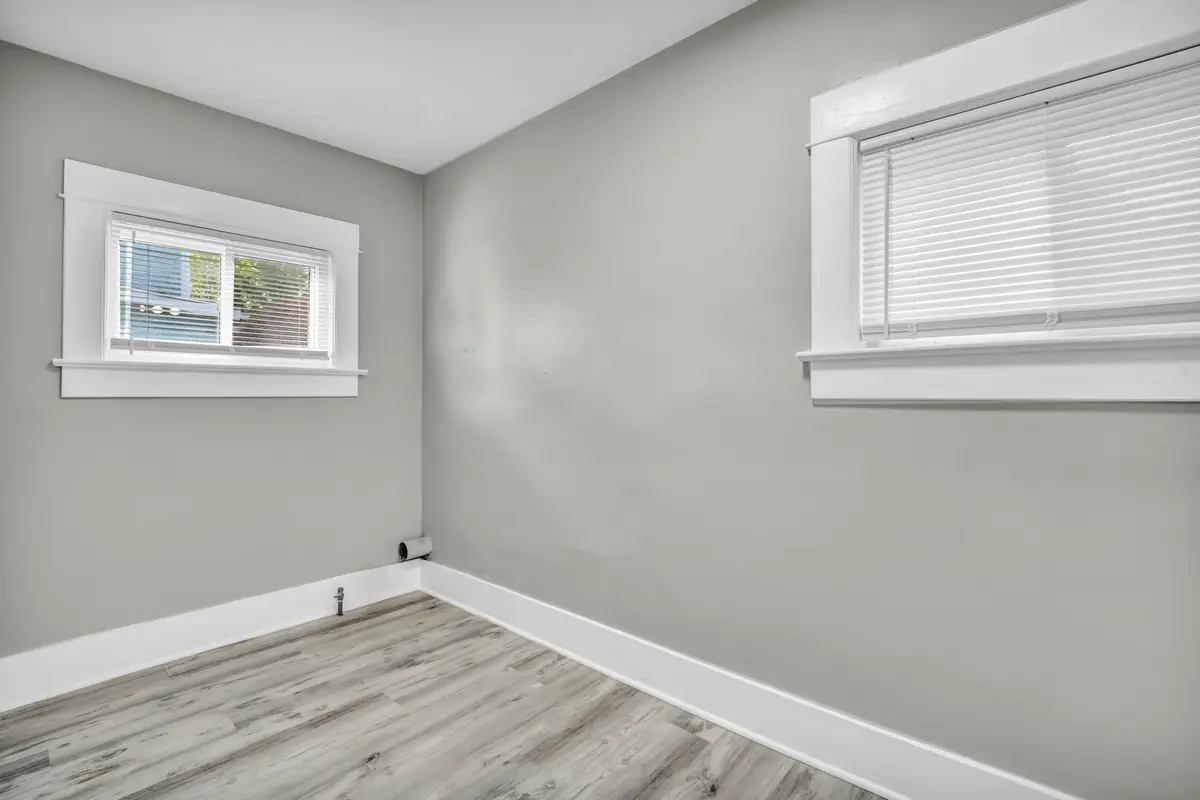
Sheen
Flat to gloss: choosing a sheen
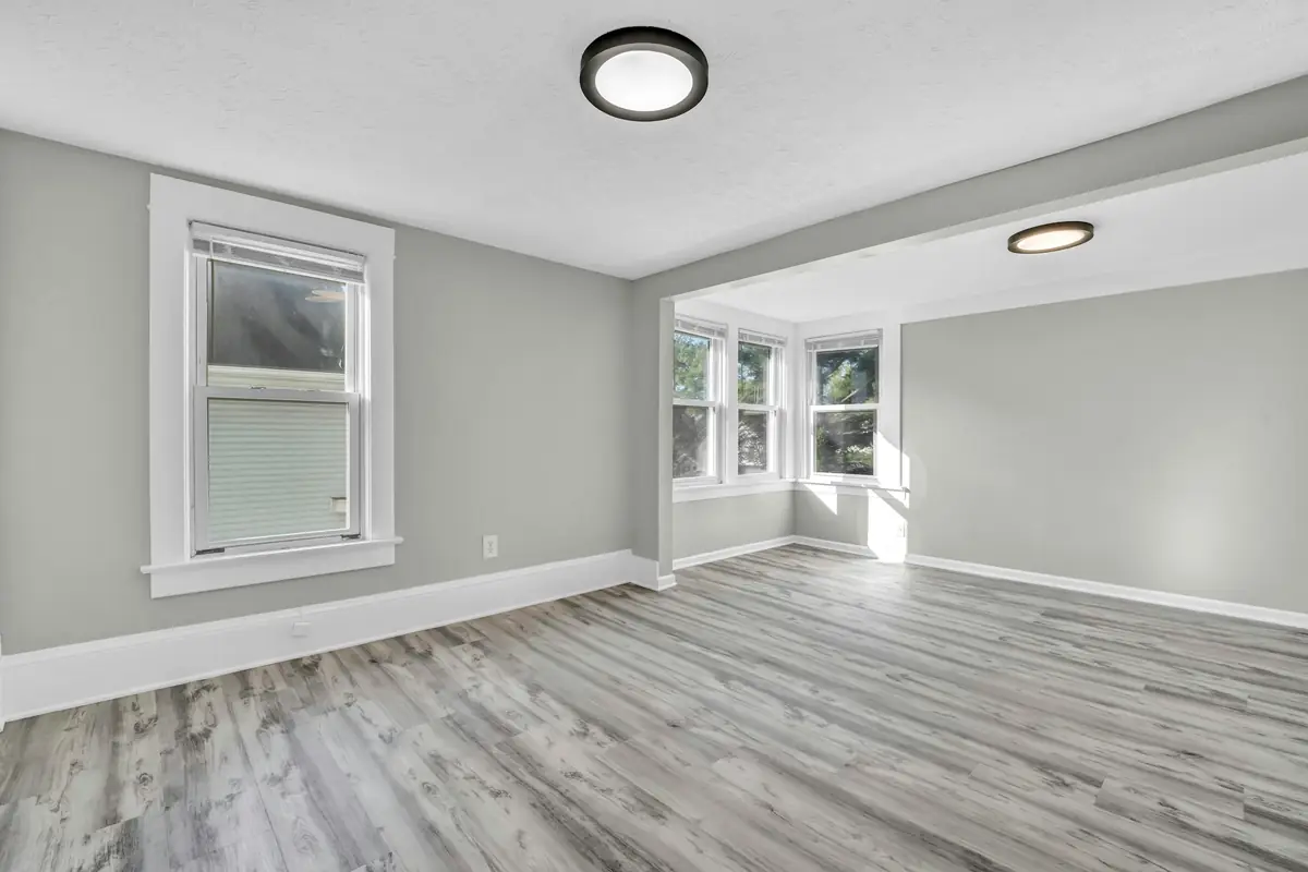
Sheen changes how a color looks. Benjamin Moore’s chart runs from the finishes most forgiving of imperfections to the most durable: the lower the sheen, the better it hides flaws; the higher, the longer it wears. Higher sheens and lighter colors also reflect more light into a room (Sherwin-Williams).
From low to high, in Benjamin Moore’s descriptions: flat has no shine, hides flaws and suits ceilings and very low-traffic areas, but stains are harder to remove and constant scrubbing can burnish it. Matte is nearly as shine-free and stands up to frequent washing, even in hallways and family rooms. Eggshell is easy to clean and suits most rooms. Satin has more gloss and better stain resistance, for windows, shutters, trim and interior doors. Semi-gloss gives trim, doors and millwork dimension. Gloss accentuates blemishes, so it belongs only on completely smooth surfaces.
Sherwin-Williams draws the lines a little differently: it calls flat prone to scuffs and stains, recommends satin for high-traffic rooms and semi-gloss for trim and moldings, and lists its satin and eg-shel finishes as washable for hallways, woodwork, children’s bedrooms and family rooms. The label of the product on your walls is the one that counts. Cabinets are their own subject: see cabinet painting.
Benjamin Moore’s common sheen uses, inside
- Flat: ceilings, walls in low-traffic spaces
- Matte: walls, living rooms, dining rooms, bedrooms
- Eggshell: high-traffic walls, living and dining rooms, bedrooms
- Low lustre: doors, trim
- Satin: high-traffic walls, trim, doors, cabinets
- Semi-gloss: trim, doors, cabinets, wainscoting
- Gloss: trim, doors, cabinets, architectural details
Trim and doors
White trim, or one color for walls and trim
Benjamin Moore’s advice for white trim is to match its undertone to the walls: with warm walls (red, yellow or orange undertones), a white with a similar undertone; with cool walls (blue, green or purple), a crisp white. One white for the crown molding, the ceiling and the trim is a popular approach. For trim that stands out, it suggests a bolder trim color against neutral walls, such as off-whites, greiges and taupes.
The other approach removes the contrast: trim and doors in the wall color. Sherwin-Williams suggests varying the sheen so the surfaces still read apart, for example satin on the trim and gloss on the doors, and Benjamin Moore’s color expert likes painting the interior doors to match as well, for a completely uninterrupted look.
Popular trim sheens are satin, semi-gloss and high gloss (Benjamin Moore). The glossier the finish, the more the surface underneath shows: the USDA Forest Products Laboratory notes that gloss accentuates planer marks, hammer marks, raised grain and joints in wood, so high-gloss work needs more surface preparation.
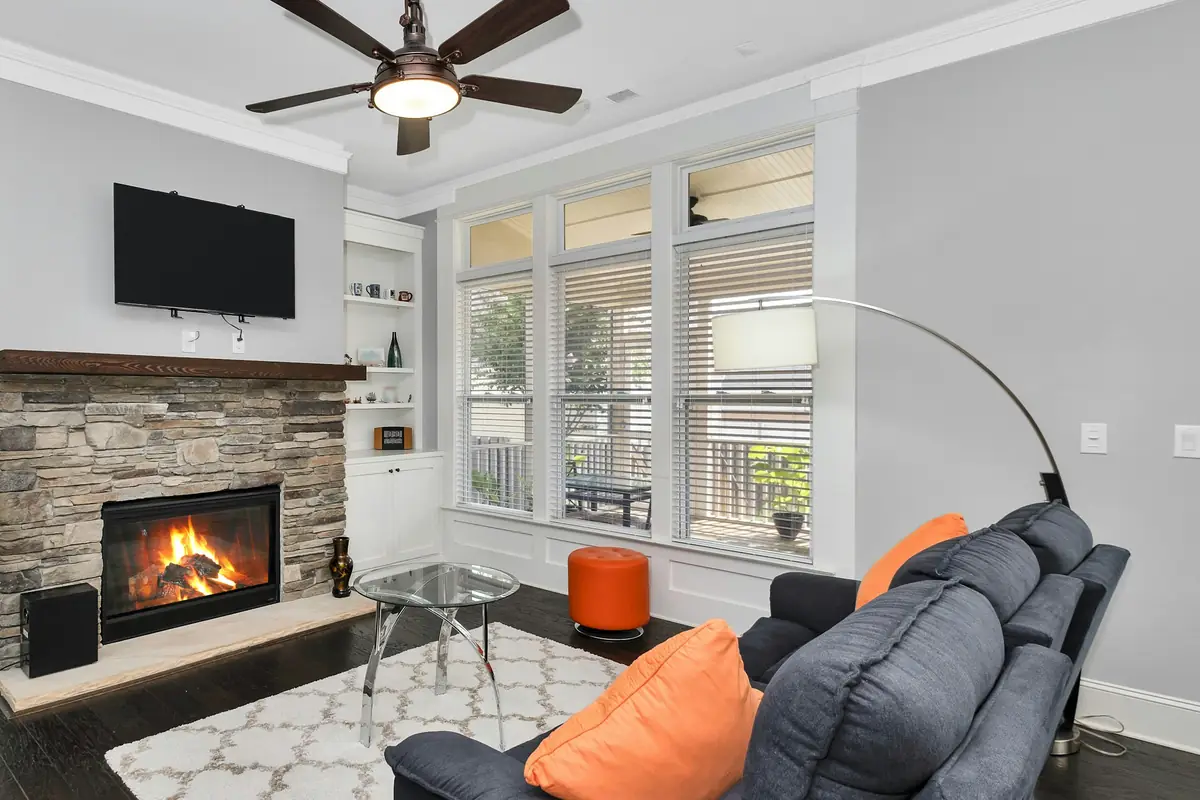
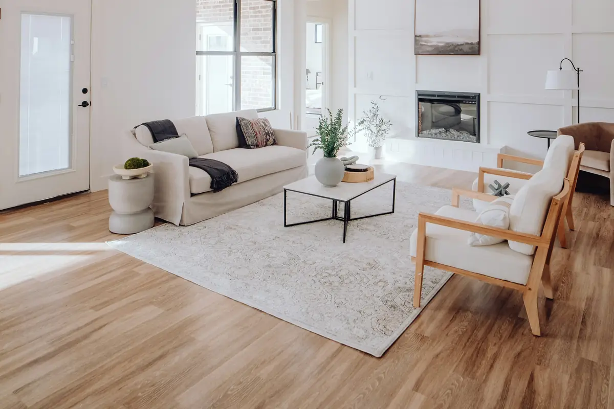
Stairs and halls
Stairwells: colors that hide scuffs
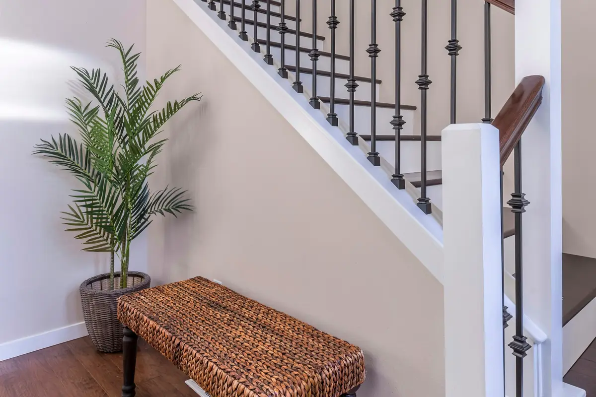
Stairways take heavy traffic, so Sherwin-Williams recommends a durable paint there, with satin or semi-gloss on the stair trim because those sheens are tougher and easier to clean.
Color helps too. Sherwin-Williams notes that mid-tone neutrals, grays and some darker shades hide everyday marks better than a stark white, so the walls need cleaning less often, while white and light neutrals make a stairwell feel bright and airy. It also suggests planning the stairway color with the floors and the railings.
Lower levels
Basements and rooms lit mostly by bulbs
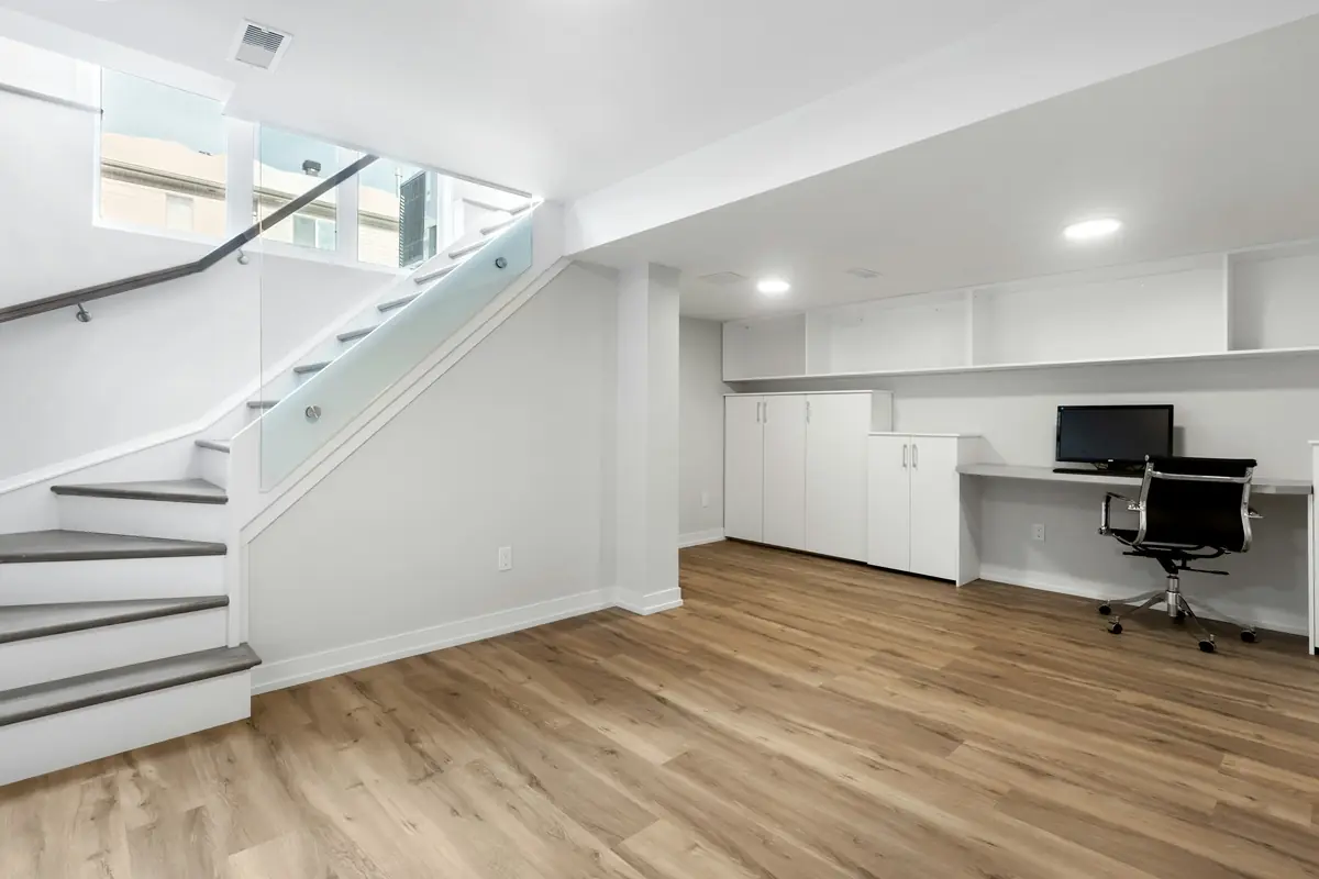
Basements tend to get little daylight, and Sherwin-Williams’ basement advice starts there: the higher a color’s LRV, the more light it reflects, so a light, airy color helps make up for the missing daylight, and very dark colors are best avoided unless the space has plenty of natural or electric light.
Below ground, the bulbs decide a lot. Sherwin-Williams suggests choosing bright white, cool or warm lighting first, and points out that lighting is easy to change to make a color look better. With warm bulbs, choose colors as you would for a south-facing room; with white or cool bulbs, as for a north-facing room. Benjamin Moore adds that bulbs above about 3500K cast cooler.
Moisture comes before color. Sherwin-Williams lists high basement humidity among the causes of peeling paint indoors, says the cause has to be found and fixed, and notes that proper ventilation fixes most interior moisture problems. The EPA advises keeping indoor relative humidity below 60 percent, ideally between 30 and 50 percent, notes that warm, humid air condenses on cold surfaces, and puts it simply: the key to mold control is moisture control.
Brick
Painting brick: hard to undo
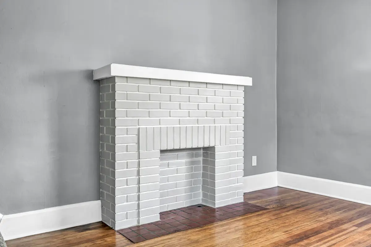
The Brick Industry Association’s Technical Note 6 (August 2024) starts with a warning: paint can be very difficult to remove from brick without damaging it, and painted exterior brick can need repainting regularly, depending on the paint.
Moisture is the first question. The association says most deterioration of brick comes from moisture problems that were never dealt with, and that a treatment which traps moisture in the wall can make things worse. Outdoors, where brick gets wet and often freezes and thaws, it generally recommends treatments that let the wall dry, keeping its water vapor permeance high.
That shapes the choice of coating. Mineral (silicate) paints and limewash soak into the brick and keep it breathable: mineral paint goes only on clean, unsealed brick and typically carries a warranty of 15 years or more, and limewash can last five to ten years or more and can be recoated without removing the old coats. Acrylic latex paint forms a film that is only semi-permeable to vapor, so the association advises against heavy coats, recommends an alkali-resistant primer or a paint made for masonry, and calls latex on brick a recurring maintenance task.
Indoors, brick is usually kept dry and away from frost, so a wider range of treatments can be used. A fireplace surround usually needs extra cleaning to remove soot before it is painted. Whatever goes on, try a sample panel first, and judge it only when it is completely dry, since a treatment can look different wet.
Outside
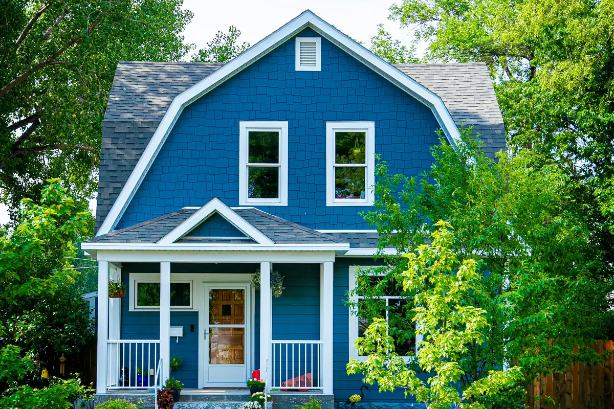
Exterior schemes: body, trim and accent
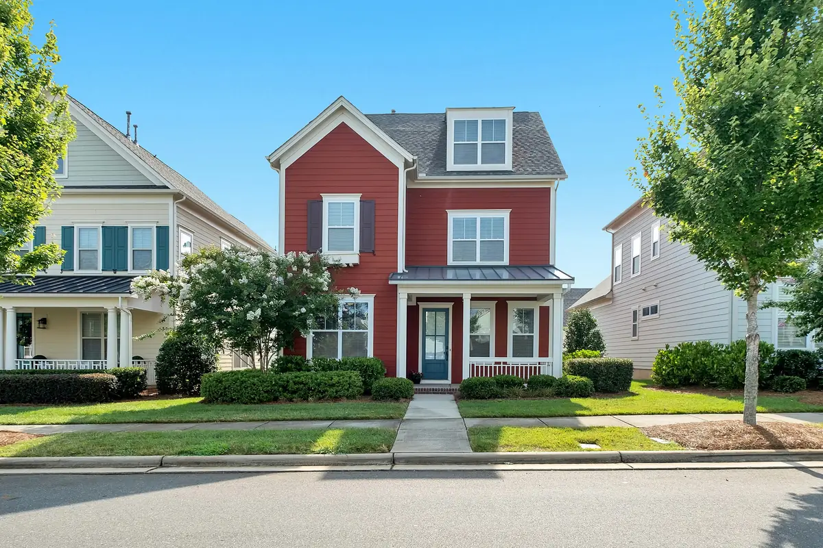
Benjamin Moore’s starting point for an exterior palette is the part of the house you are not repainting: the roofing, stone, brick and landscaping. It also suggests weighing the natural surroundings and the color schemes of the neighboring houses.
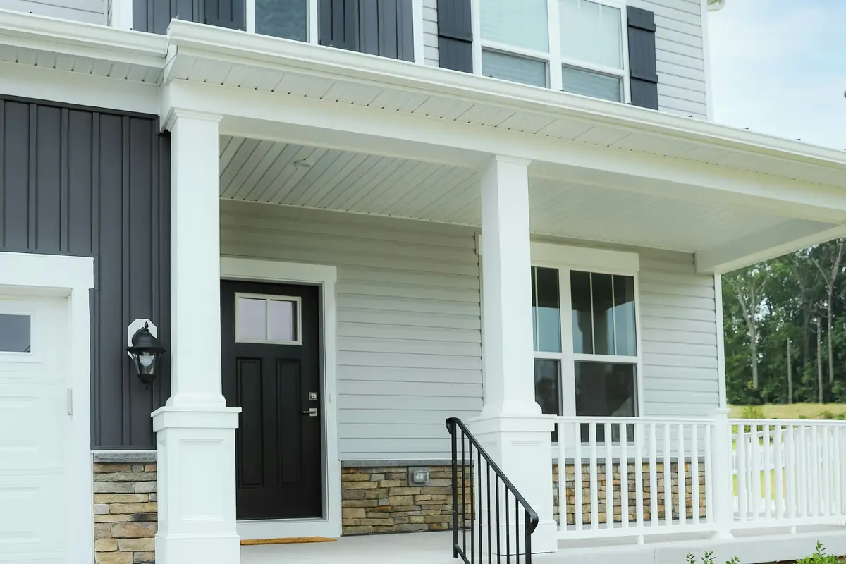
Sherwin-Williams describes a scheme in three parts: a main color, a trim color, and accent colors chosen to complement both, typically on the front door and shutters. Benjamin Moore puts accents on the smaller, attention-worthy parts of a house: front doors, window trim, shutters and garage doors.
Accents can look very different as the light changes through the day, so Benjamin Moore advises sampling them too. Outside, paint the samples on white foam board, since its liquid samples are made for interior use only, and watch them through the day, allowing for sun and shade: a color under a shade tree looks a little darker than the same color in direct sun.
Exterior sheen
Trim, doors and sheen outside
Exterior sheen charts differ by brand. Benjamin Moore’s chart lists no flat, matte or eggshell uses outdoors: low lustre for siding and trim; satin for siding, trim, shutters and doors; semi-gloss or soft gloss for trim, shutters, doors and architectural details; and gloss for doors and architectural details. Sherwin-Williams, by contrast, lists a matte finish for exterior siding, and its satin and eg-shel finishes for exterior surfaces.
The pattern is the same either way: the lower sheens on the large areas, the glossier finishes on trim, shutters and doors. Benjamin Moore notes that semi-gloss gives trim and doors dimension and that gloss accentuates blemishes, so it belongs on completely smooth surfaces; the USDA Forest Products Laboratory adds that high-gloss finishes need more attention to the surface underneath for the same reason. The product’s own label and data sheet say which sheens it comes in and where each one may go.
Dark colors
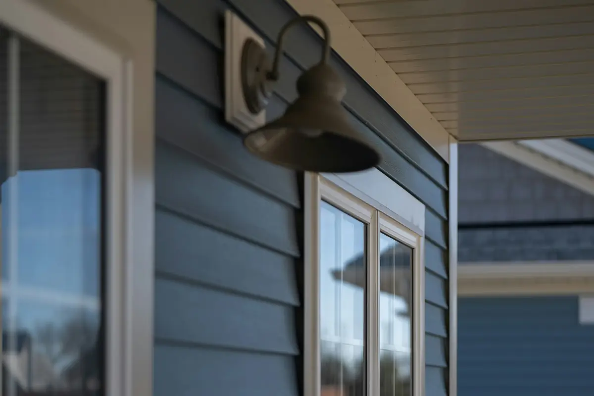
Dark colors on wood and vinyl siding
Dark colors have a cost outside. The USDA Forest Products Laboratory’s Wood Handbook (2021) says darker finishes heat up more in the sun, which causes more warping and checking of wood than light finishes, and makes water blisters more likely (see how blisters form). Dark colors may fade within a few years, some pigments fade more than others, and many dark finishes fade unacceptably long before the paint itself fails, so the Laboratory suggests checking with the paint maker. In its words, “White is always a safe choice.”
Vinyl siding is stricter. Sherwin-Williams says vinyl that warps after painting was usually repainted darker than its original color, because dark paint absorbs the sun’s heat and passes it to the vinyl. Both paint makers’ data sheets set a floor: no darker than the original color, and no light reflectance value below 56 (Sherwin-Williams) or 55 (Benjamin Moore), unless the color comes from their vinyl-safe palettes. AZEK, which makes PVC trim and siding, requires an LRV above 55. Sherwin-Williams adds that departing from the siding maker’s painting guidelines may void its warranty.
The paint makers say their vinyl palettes widen the choice: Sherwin-Williams offers 100 VinylSafe colors, some of them darker, formulated to resist warping on sound, stable vinyl, and Benjamin Moore offers 75 colors for vinyl and says to check the siding maker’s guidelines and the data sheet first. The vinyl siding trade association, PEPA, says painting is often unnecessary, could void the product warranty, and should be checked with the siding manufacturer first. In practice: a color no darker than the siding is now, with an LRV of 56 or higher (which clears all three of these LRV limits), or a color from the paint maker’s vinyl-safe palette; either way, the siding maker’s rules checked before any paint is bought. Siding types and their prep are on the exterior painting page.
Porches
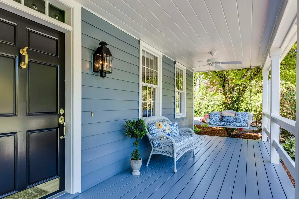
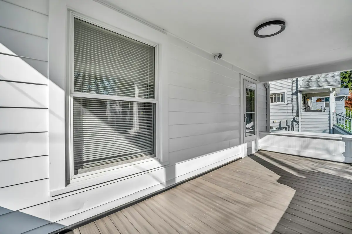
Porch ceilings and floors
Porches get wet from wind-blown rain, so the USDA Forest Products Laboratory advises sealing or priming all porch wood, the flooring, railings and posts and especially the end grain, and notes that primers and topcoats for porch floors are formulated to resist abrasion. Paint on a railing traps moisture if the end grain was never sealed.
Porch ceilings cool quickly, so dew forms on them, and the Laboratory notes that the dew feeds mildew. For color, Benjamin Moore suggests pairing a light blue porch ceiling with a classic white to draw the eye upward.
For the floor, Benjamin Moore says there are no rules: a different hue makes the porch stand out, while the house color, or a shade or two darker, blends it in. Whatever the color, use a coating made for floors. Sherwin-Williams rates its Porch & Floor Enamel for high-traffic surfaces inside and out, porches and basement stairs among them, and says it meets the low-slip rating the Americans with Disabilities Act requires. Benjamin Moore’s floor enamel data sheet says not to apply it below 50°F and warns that all floor coatings may become slippery when wet, so add an anti-slip aggregate where needed.
Common questions
What does the LRV on a paint chip mean?
It is the color’s light reflectance value: how much light the color reflects, on a scale where 0 reflects none and the top reflects all of it (Sherwin-Williams uses 0 to 100, Glidden 0 to 99). Sherwin-Williams prints it on the back of its chips and lists it in each color’s online details. Its rules of thumb: for a crisp, airy neutral, a mid-range LRV of about 50 to 60, and for a north-facing room, 60 or higher. Lighter colors and higher sheens reflect more light.
What color should I paint a north-facing room?
There are two schools. Sherwin-Williams says to avoid cool undertones in a north-facing room and choose a warm neutral or a color with warm undertones; Benjamin Moore suggests a clean white with a hint of yellow, or grays with warm undertones, but notes that cool blue-grays are popular there too. Either way, look for a higher LRV and test a large sample in the room itself, through the day and into the evening.
Should trim be white, or the same color as the walls?
Either works. With white trim, Benjamin Moore suggests matching the white’s undertone to the walls, and notes that one white for the crown molding, ceiling and trim is popular. With trim in the wall color, Sherwin-Williams suggests a different sheen on the trim and doors so they still read apart.
Can you paint a brick fireplace?
Yes, with care. The Brick Industry Association says not to coat the firebox of a fireplace that is still used, to clean soot off the surround before painting, and warns that paint can be very difficult to remove from brick later. Indoor brick allows a wider range of treatments than outdoor brick. Try a sample panel and judge it only when it is fully dry.
Can vinyl siding be painted a darker color?
Usually not darker than it is now. Darker paint absorbs more heat and can warp vinyl, so Sherwin-Williams’ and Benjamin Moore’s data sheets set LRV floors of 56 and 55 unless the color comes from their vinyl-safe palettes. The vinyl siding trade association says painting is often unnecessary and could void the product warranty, so check with the siding manufacturer first.
Why does a paint color look different at night?
Because the light changes. Benjamin Moore notes that both daylight and electric light shift how an undertone reads, and that bulbs above about 3500K cast cooler. Sherwin-Williams suggests choosing the bulbs first for a room lit mostly by lamps, and Benjamin Moore suggests testing colors from morning to evening under both kinds of light.
Why are some porch ceilings painted blue?
Benjamin Moore says blue porch ceilings, long popular in the southern United States, have made their way north over time, and suggests a light blue ceiling with a classic white to draw the eye upward. The history is less certain. Historic New England (2021) writes that most historians attribute blue porch ceilings to the traditions of the Gullah Geechee people, and The Post and Courier (2019, updated 2024) reports that the history is hard to document: the earliest newspaper use of the name “haint blue” that an architectural historian has found dates only to 1985.
Can you paint basement concrete?
Only when it is dry. Sherwin-Williams says to check concrete with a moisture meter before painting (no higher than 5%), because moisture trapped under the paint can make it bubble and peel. A simpler check it suggests: tape a 1 to 2 ft square of 3-mil plastic to the surface and see whether moisture forms under it in a day or two; a smooth floor also needs etching. For garage and basement floors, see epoxy floor coatings.
Does an older house change anything?
It can. The EPA says homes built before 1978 are more likely to have lead-based paint, and recommends hiring a contractor certified and trained in lead-safe work practices. In Wisconsin, the Department of Health Services runs the Lead-Safe Renovation Rule under EPA authorization: anyone doing, or even offering to do, most paint-disturbing work on homes and child care centers built before 1978 must be trained and certified first.
Sources
What this guide is based on
Manufacturer guidance: Sherwin-Williams, Benjamin Moore and Glidden (PPG) on color, light, samples, sheen and trim, with their exterior paint and floor enamel data sheets, and AZEK on painting PVC trim and siding. Industry and government guidance: the Brick Industry Association’s Technical Note 6, the USDA Forest Products Laboratory’s Wood Handbook (chapter 16, “Finishing Wood”, 2021), the EPA, the Polymeric Exterior Products Association and the Wisconsin Department of Health Services. University: the Wisconsin State Climatology Office at UW–Madison. History: Historic New England and The Post and Courier. LRV limits and sheen charts are brand-specific: the label and data sheet of the product used on your house override this guide.
Written by Modern Painters LLC. Last reviewed 23 October 2026. Corrections: hello@modernpainterswi.com.
Sources (read 23 October 2026)
- Sherwin-Williams: color by room direction
- Sherwin-Williams: Worthy of Reflection (LRV)
- Sherwin-Williams: neutral paint colors
- Sherwin-Williams: understanding paint undertones
- Sherwin-Williams: basement paint colors
- Sherwin-Williams: stairway paint colors
- Sherwin-Williams: paint sheen guide
- Sherwin-Williams: walls, doors and trim in one color
- Sherwin-Williams: exterior accent colors
- Sherwin-Williams: vinyl siding warping
- Sherwin-Williams: Resilience data sheet (08/2020)
- Sherwin-Williams: VinylSafe colors
- Sherwin-Williams: Porch & Floor Enamel
- Sherwin-Williams: painting interior concrete
- Sherwin-Williams: painting application FAQ
- Sherwin-Williams: peeling due to moisture, inside
- Benjamin Moore: warm and cool colors
- Benjamin Moore: greige paint colors
- Benjamin Moore: north-facing rooms
- Benjamin Moore: south-facing rooms
- Benjamin Moore: how to use paint samples
- Benjamin Moore: FAQ
- Benjamin Moore: how to choose a paint finish
- Benjamin Moore: trim paint ideas
- Benjamin Moore: exterior house colors
- Benjamin Moore: exterior accents
- Benjamin Moore: painting vinyl siding and trim
- Benjamin Moore: W103 data sheet (2020, PDF)
- Benjamin Moore: porch and patio colors
- Benjamin Moore: floor enamel data sheet (2020, PDF)
- Glidden (PPG): how to use paint chips
- AZEK Exteriors: painting resources
- PEPA: vinyl siding cleaning and care
- Brick Industry Association: Technical Note 6 (2024, PDF)
- Forest Products Laboratory: Wood Handbook ch. 16 (2021)
- EPA: mold course, chapter 2 (Dec 2025)
- EPA: ten things about mold (Sep 2026)
- EPA: renovation rule for consumers (May 2026)
- Wisconsin DHS: Lead-Safe Renovation Rule (Aug 2026)
- Wisconsin climatology office: November outlook (2025)
- Historic New England: “Haint Blue” (May 30, 2021)
- Post and Courier: haint blue (2019, rev. 2024)
Repainting inside or out?
Tell us about the rooms or the house, and we’ll call or email to set a time for a free written estimate.